Redesigning my website

Well, after using the same template (since discontinued I just found out) for the past four years, I decided it was time to update the page. Maybe it goes with recent changes in my life, a new position (Assistant --> Associate rank), first kid, new house. So, in the spirit of change, I decided to go with a new look. And to be honest, thus far I am much happier. First off, as you probably have noticed, I ditched the dark color theme and went for a more vibrant white look - which seems to be very popular these days.
When designing the website, I decided to focus on primarily my news section on technology/digital health/innovation in pharmacy, and my musings/blog section. Along with that, I expanded a more direct contact feature for those that wish to engage me for services (e.g., writing, speaking, consulting). Lastly, I wanted a better home screen to welcome readers to the website.
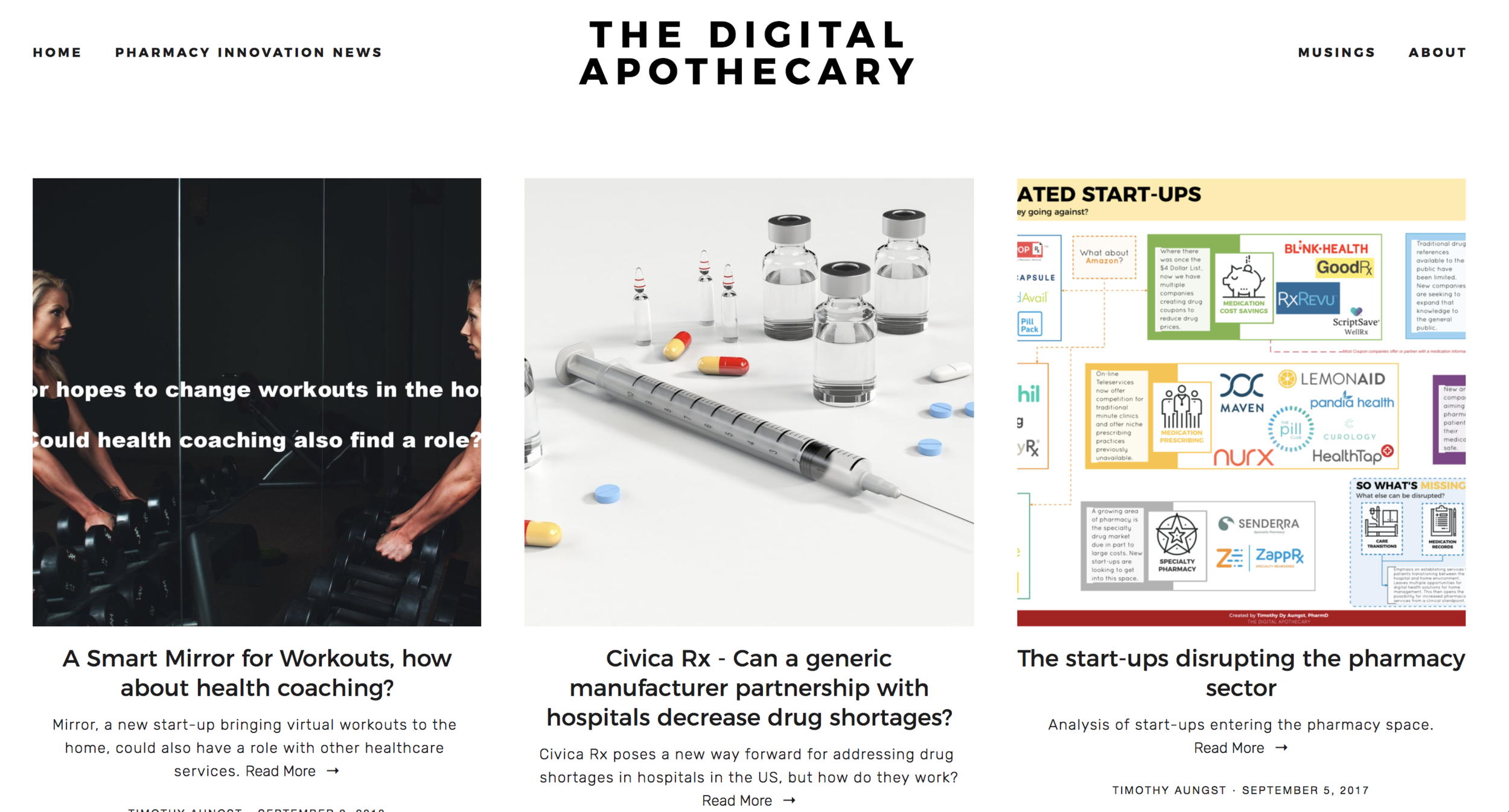
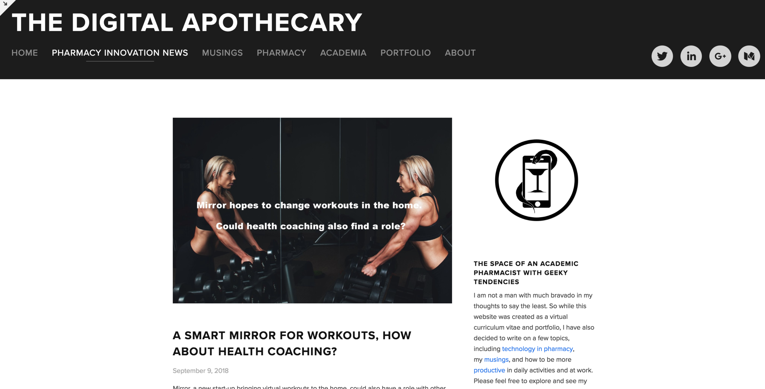
One thing that stood out with the redesign is the focus of my posts with images to really stand out with thumbnails. I think this was a right decision as when reviewing my analytics I noticed people weren't hoping between material. On the one hand, I think it was too many options, and that the template I was using was meant for individual pages. The blog feature required users to use a sidebar to navigate (which I ditched) or scrolling through everything. I hope the change will make it easier for people to browse material much more relaxed. The only issue is that I need to be much more visual this time around and use better images.

The next item of business as I alluded to was to ditch all the different sections I had. I mean, I had items for academia, personal projects, blogging, news, how-to guides, etc. The issue is that I more often than not would get the idea it would be great to start a new thing on the website, only to get distracted and forget to add anything else to it. Thus, I elected to just concentrate on three things: News, blogging, and personal contacts.
So with that being the case, I hope you enjoy the new look! Feel free to leave comments or suggestions for any particular changes!